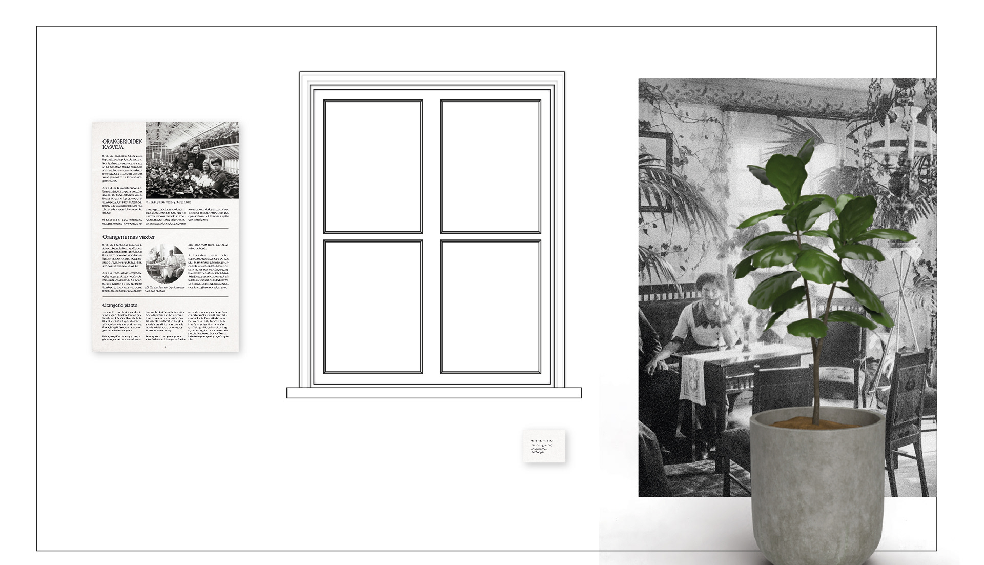
A mock up for the wall with windows on the larger room.
In late 2022, I was approached by the city of Espoo to see if I would be interested in designing the layout for their upcoming exhibition, which aims to explain the history and origins of today's house plants. I've undertaken similar projects before, but none on such a large scale. o my surprise, the project turned out to be immensely enjoyable! The project involved extensive teamwork and various design aspects, including drawing the general plan in Illustrator and creating the actual posters in InDesign. I also had the opportunity to familiarize myself with pre-made 3D elements that can be downloaded and utilized to enhance the planning process.
Bringing the Plan to Life
The old house had been measured several times, making it challenging to find accurate data for the plans. Ultimately, the measurements were slightly off in some areas, but the skilled builders of the exhibition managed to adapt and fit everything together beautifully.
A plan for the second wall on the smaller room.
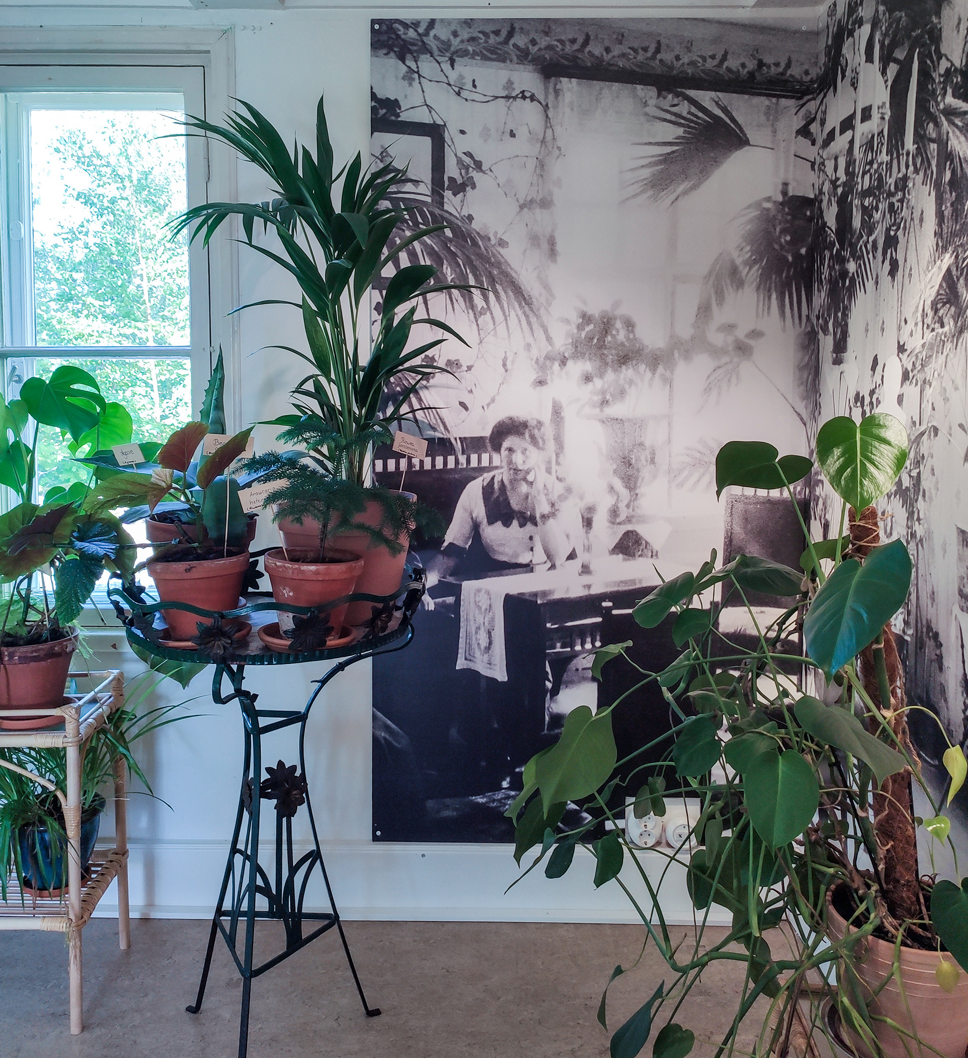
The corner between the second and the third wall at the actual exhibition. Photo: Teija Alanko
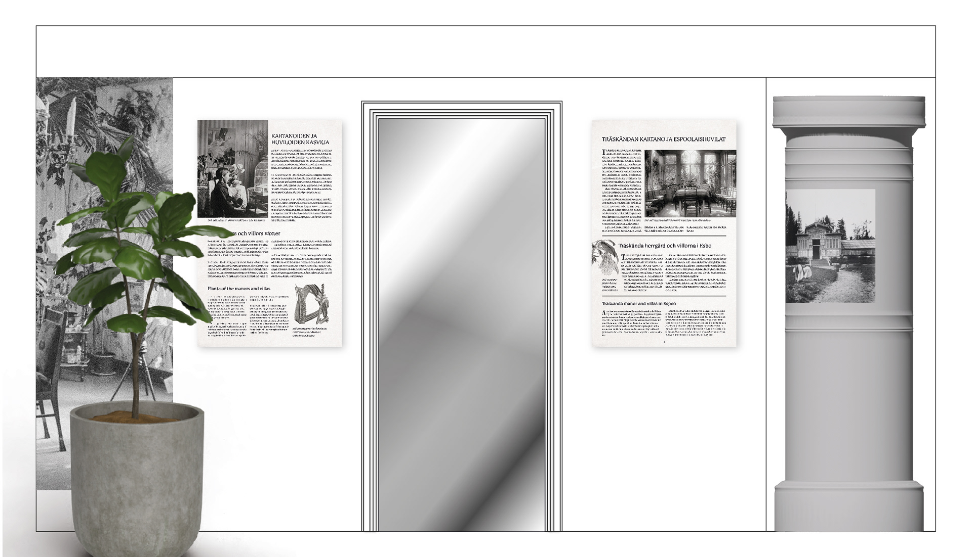
A plan for the third wall on the smaller room.
Information Panels
The knowledge and historical aspects of the exhibition were conveyed through twelve information panels. At first there was a discussion that the panels would contain just text and historical images would be displayed separately. However, it quickly became apparent that plain text alone would be unengaging, and this approach would not leave enough space for many historical images. Therefore, I delved into digital archives, found samples of old magazines, and decided to incorporate elements of their layout. This helped visually integrate the panels with the exhibition's theme. Moreover, this approach enabled me to double the number of pictures used in the exhibition. The more varied the storytelling, the more engaging it becomes for the viewer.
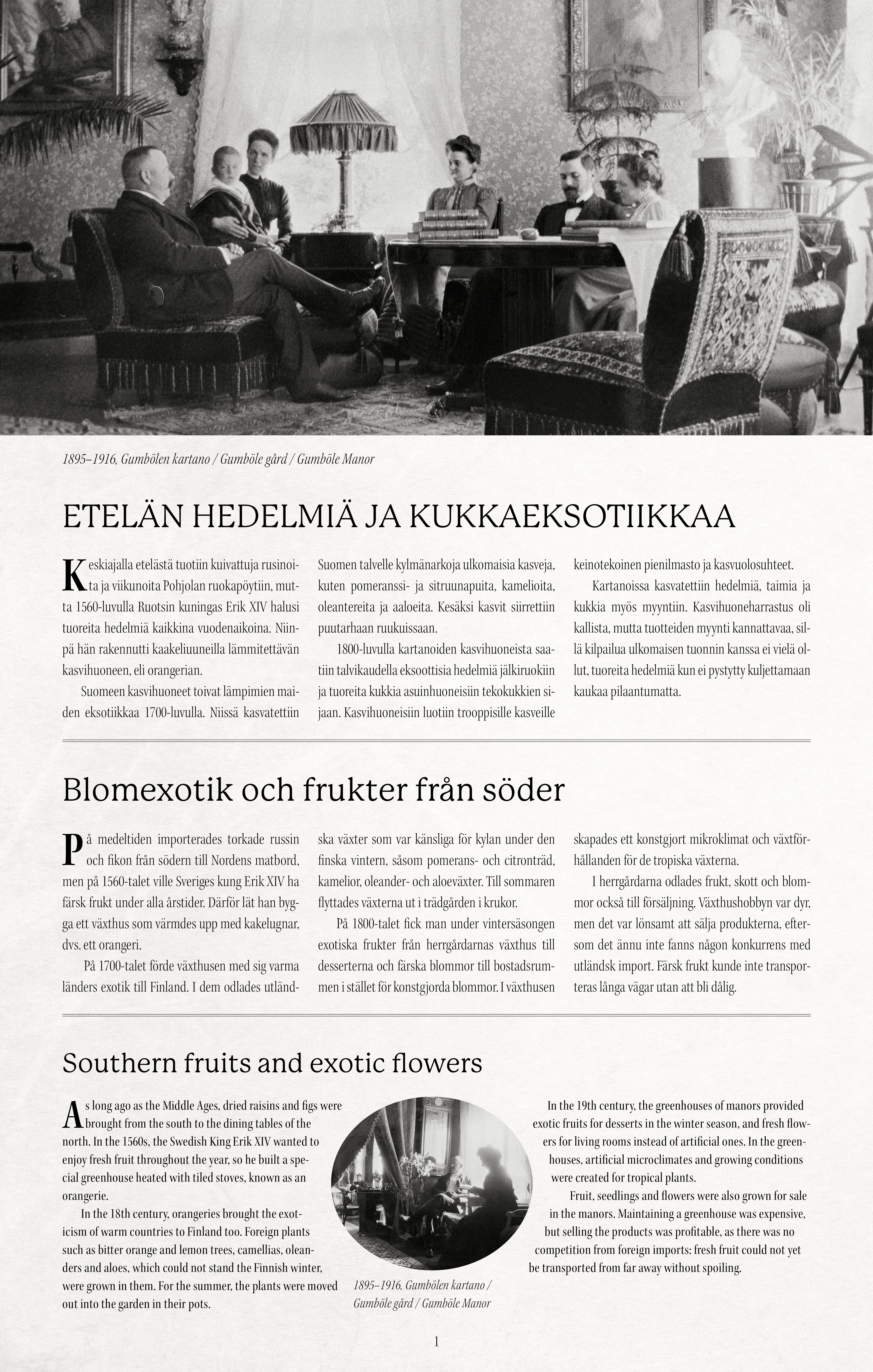
Each information panel represented a certain time period.
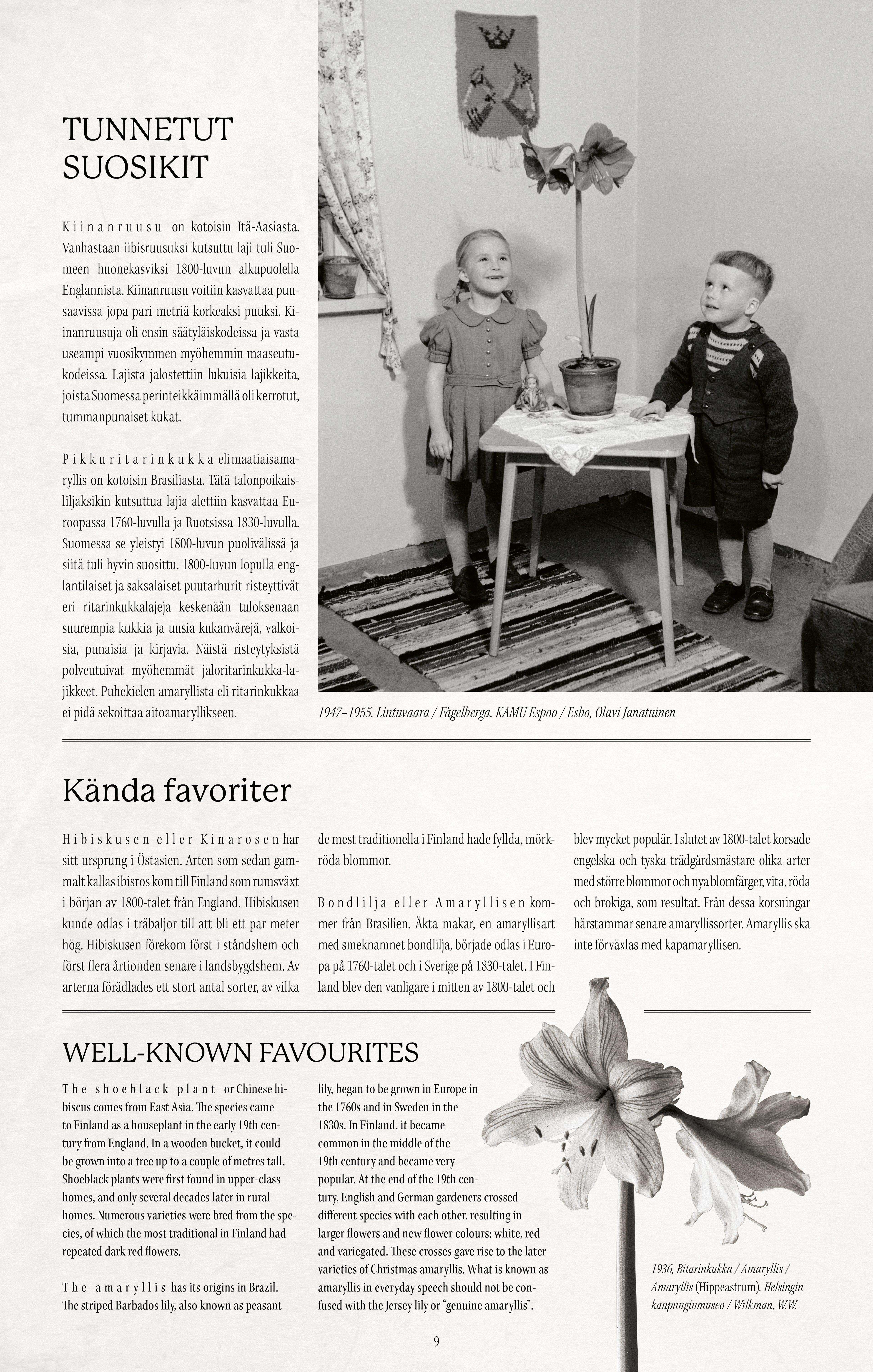
In the exhibition, everything was presented in three languages, which posed its own challenges to the design process.
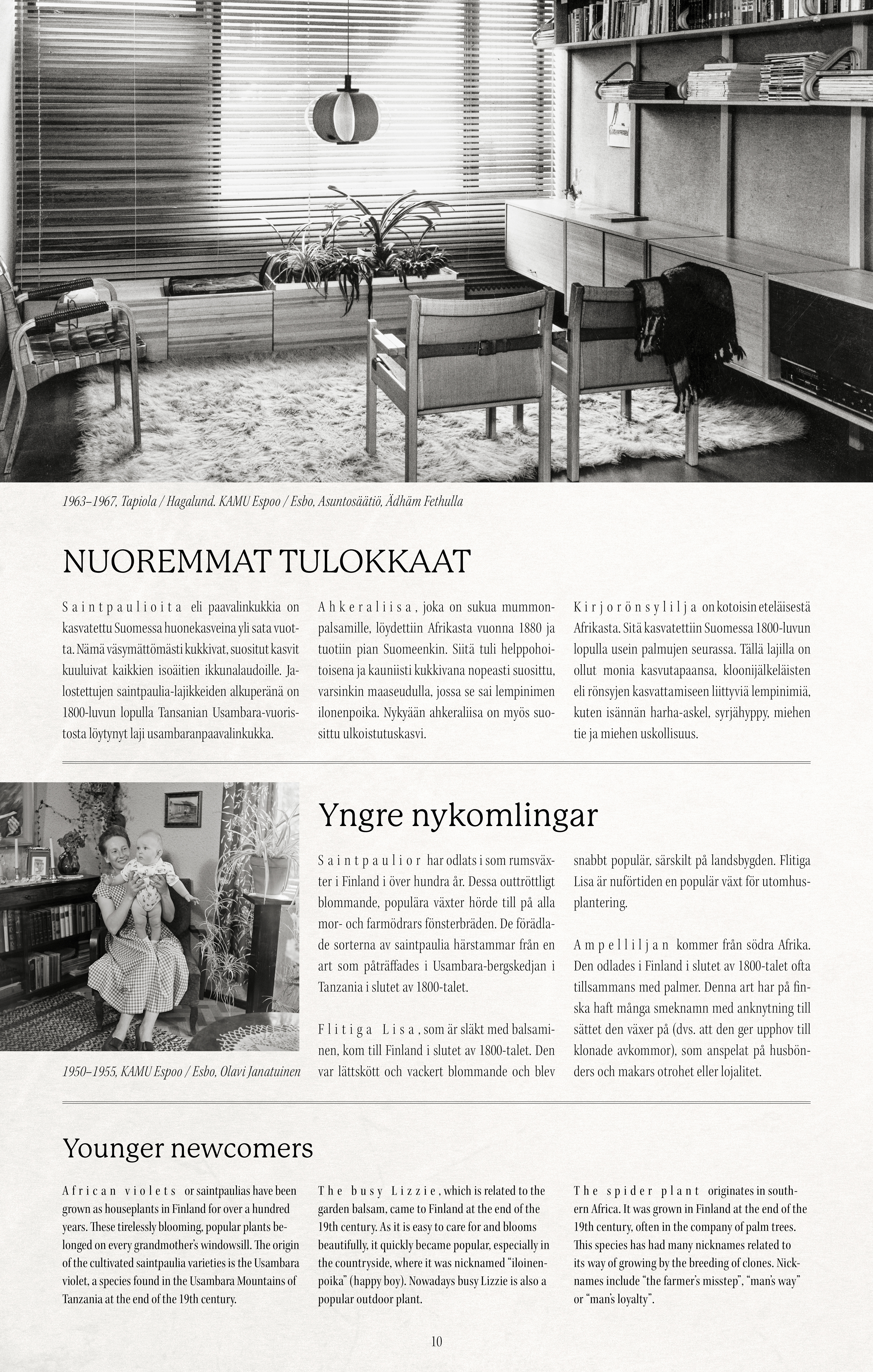
An interesting detail that emerged during my research is that a hundred years ago, bold fonts were not used. Instead, the spacing of the letters in a particular word was enlarged to make it stand out. I incorporated this feature into my information panels as well.
The Map
Early on, I was informed that the exhibition should include a large map to illustrate the original regions of various modern house plants. Eventually, someone suggested, 'What if the map functioned like a fridge door, where you can place magnets?' This idea evolved into an engaging new feature, allowing everyone, both children and adults, to place magnets—each with a picture of a plant—on the correct continent.
I found a suitable basis for the map on an online stock image site. It was vector-based and already included many elements that gave it an aged appearance. My task was to soften the apparent crispness of the lines and elements and to add a sense of texture.